Key interactions
From line to light.
Every screen starts as a thin-line layout: structure, hierarchy and gesture first. Then the light comes in.
- Gesture-based control
- Real-time feedback through light and motion
- Seamless switching between devices

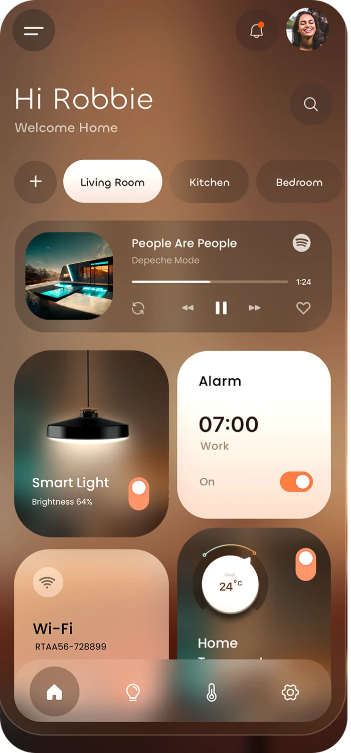

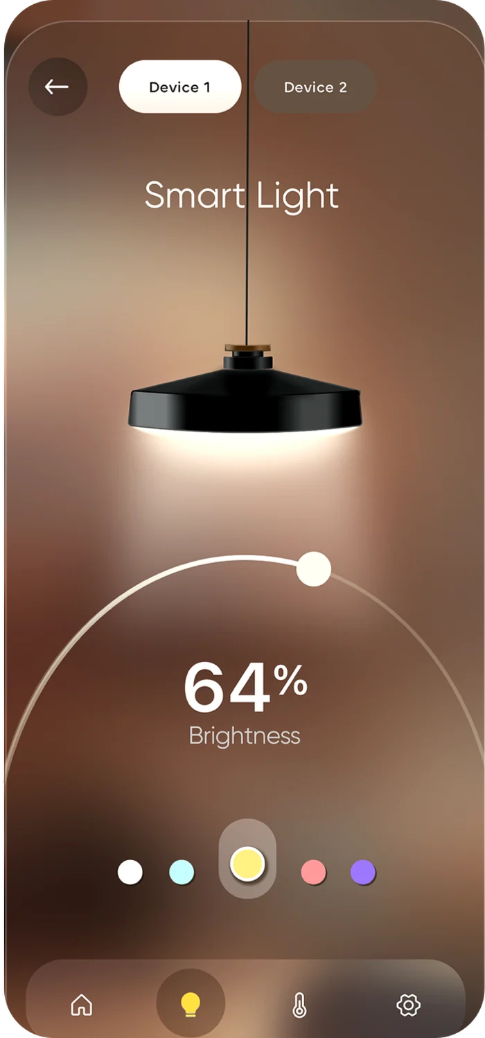

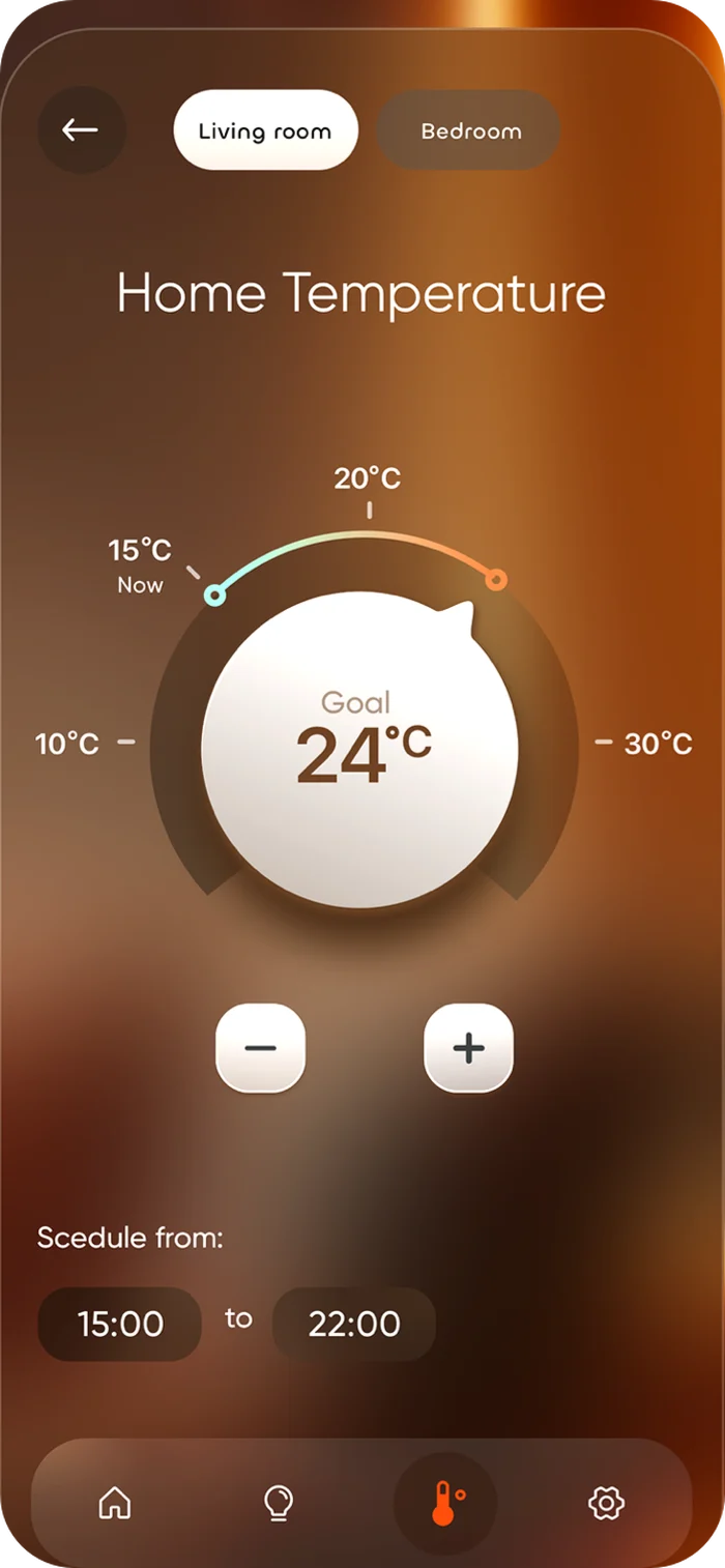
Designing a sense of comfort through digital interaction. One calm app for the lights, climate, locks and cameras of a home: hi-tech, cosy and precise.
The prototype · tap a step
The idea
Smart home systems often focus on control and efficiency. Every brand ships its own app, its own logic, its own way to say "on".
This project explores a different approach: an interface that feels like part of the home itself. Soft visuals, ambient light and customisation create a sense of comfort and presence, whether you are on the sofa or on the train.
Design principles
Frosted glass lies over the real room, so the interface feels like part of the house, not a control panel on top of it.
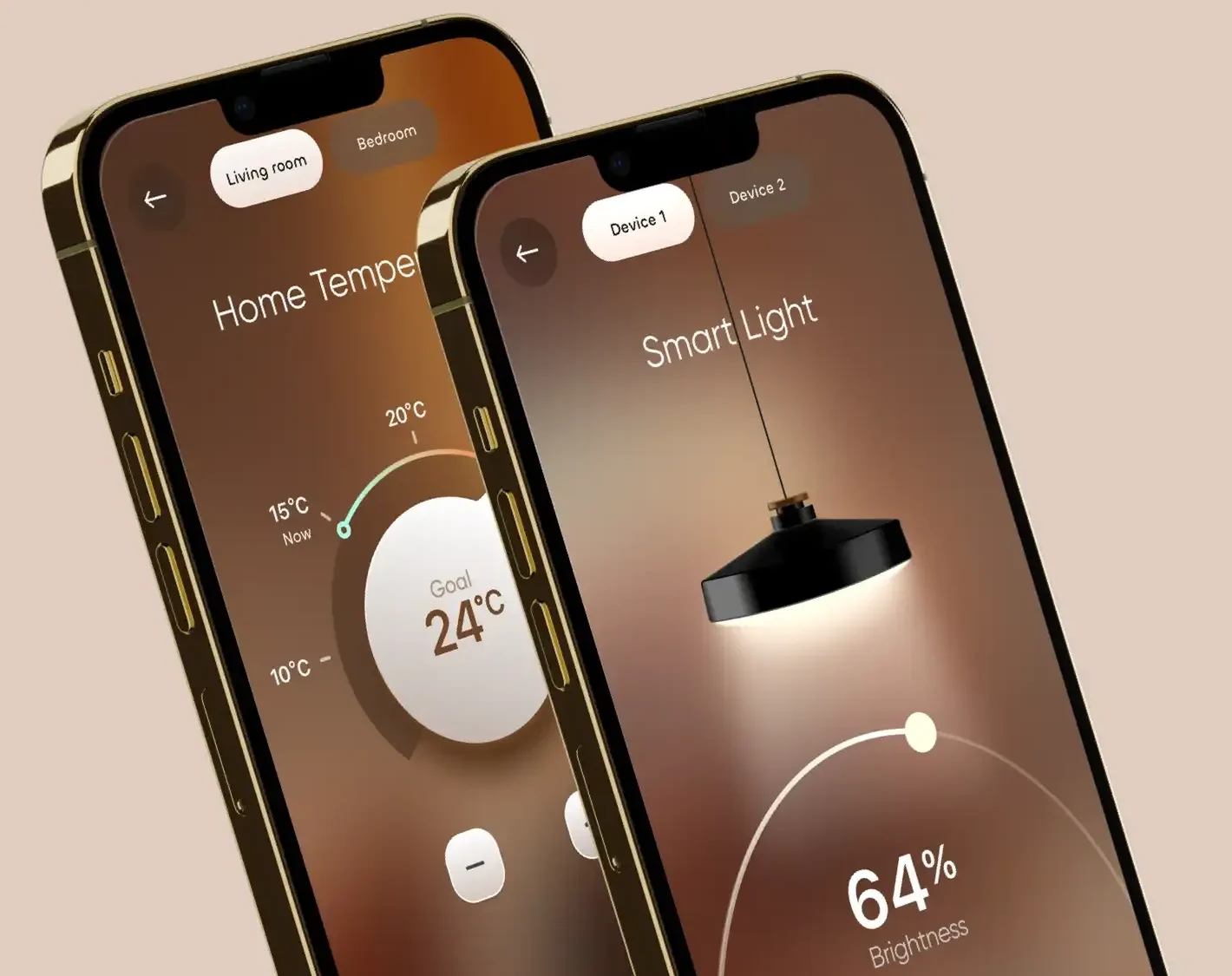
Warm neutrals taken from evening light, rounded shapes, generous spacing. One accent colour, and it only ever means "on".
The device shows its own state: the lamp on screen glows exactly as bright as the lamp on the ceiling, and the beam takes the chosen colour.
One gesture per control. Every value shows where you are and where you are going: Now 15 °C, Goal 24 °C.
Rooms, colour presets and schedules shape the home around the people who live in it.
Key interactions
Every screen starts as a thin-line layout: structure, hierarchy and gesture first. Then the light comes in.
Interface overview
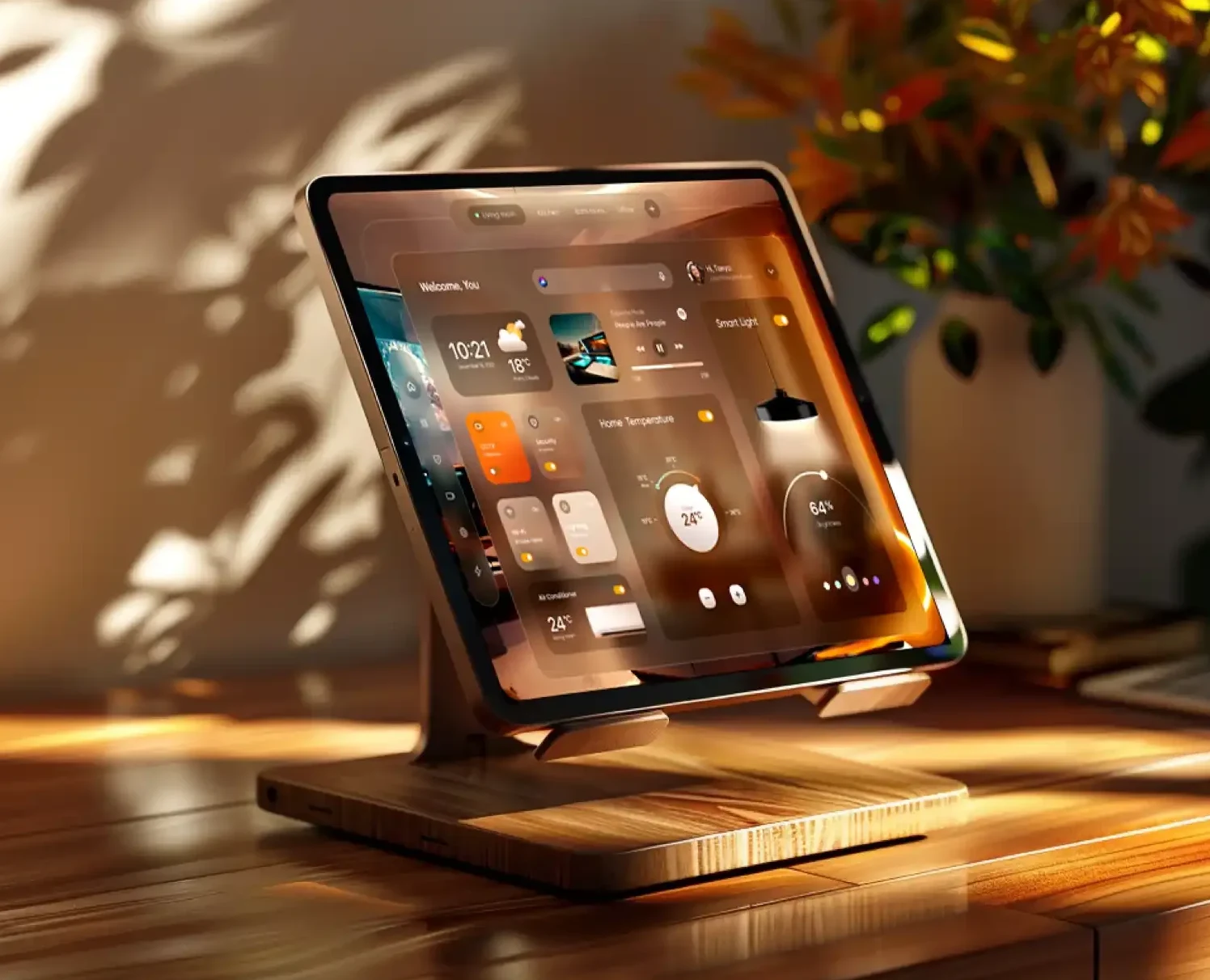
A unified interface that brings multiple devices into one calm, cohesive environment. The goal is not only to control the system, but to shape the feeling of the space.
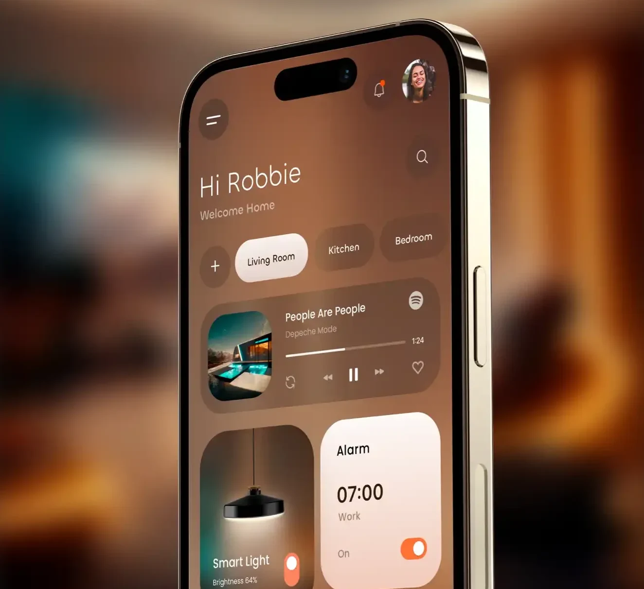
Anatomy
Colour · material
Scope for v1
Light · colour · space
The interface adapts to the space through dynamic backgrounds, light and colour. It becomes part of the environment, not just a tool for controlling it.
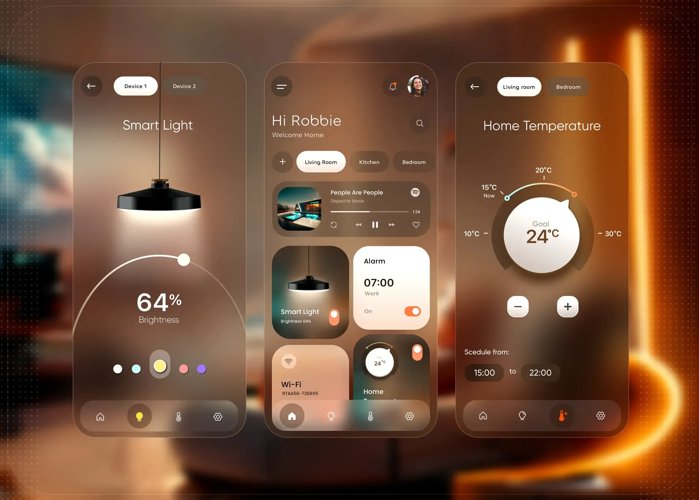
The goal is not just to control the home, but to feel it.